Buying Space, Not Keywords
In keyword advertising, you buy words. Pick “running shoes” from a list, set a bid, wait. Each keyword is an independent auction.
Embedding space doesn’t work like this. Language models map every piece of text into a continuous vector space: 3,072 dimensions for OpenAI’s text-embedding-3-large, 1,536 for Cohere’s embed-v4, 768 for Google’s gemini-embedding-001. In this space, “best running shoes for flat feet” and “marathon training plan” are nearby points, separated by a measurable distance.
If you’re running an ad auction here (using power diagrams to allocate territory, where each advertiser’s score is log(bid) - distance^2 / reach^2 and highest score wins), then the advertiser’s job is to specify a region. That’s a UX problem with no analog in the keyword world.
You Can’t Drag a Pin Across 3,072 Axes
That’s the fundamental challenge. In keyword advertising, the interface is a search box and a list. Large but enumerable. Browse it, filter it, see suggestions.
In embedding space, direct manipulation fails. Even if you project to 2D (lossy, potentially misleading), you can’t ask an advertiser to place a dot on a scatter plot and call that targeting. Moving it 10 pixels left might shift your audience from marathon runners to yoga practitioners, or it might do nothing, depending on local distortion.
You need an interface that lets advertisers navigate embedding space without touching coordinates. Semantic hill-climbing.
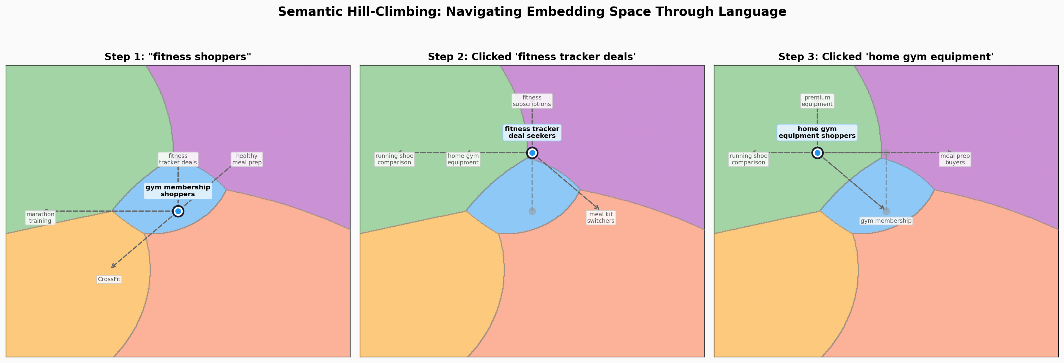
Semantic Hill-Climbing
Start with a guess. Type a natural-language description of your target: “high-intent fitness shoppers.” The system embeds that phrase and places your targeting locus at that position.
See where you are. The system shows example queries from this region:
You’re targeting: running shoe comparison shoppers
“Nike Pegasus vs Hoka Clifton” · “best carbon plate shoes 2026” · “Brooks Ghost 16 review”
The advertiser doesn’t need to understand the geometry. Read three example queries, ask: are these my customers?
Choose a direction. Suggestions at two scales, each with examples and a price tag:
Nearby adjustments:
- CrossFit class bookers, $4.20 CPM: “WOD timer app”, “CrossFit box near me”
- running community members, $3.50 CPM: “Strava running clubs”, “5K race calendar”
Explore new territory:
- meal kit service switchers, $2.10 CPM: “HelloFresh vs Blue Apron”, “weekly meal delivery”
- athleisure fashion browsers, $1.80 CPM: “Lululemon sale”, “best gym leggings 2026”
Pick one, the locus moves, new suggestions appear, prices update. Repeat.
At any point, type a free-text refinement instead. “More focused on nutrition.” “People who already own a Peloton.” The system re-embeds and moves accordingly. This is an escape hatch so it doesn’t feel like a choose-your-own-adventure with four choices per page.
Reach: The Parameter That Changes Everything
Once you’ve found your center, the second decision is σ: how broadly you compete around it.
Center is what you do. Bid is what it’s worth. σ is how far your influence extends, with decaying strength as distance grows. Keywords have no equivalent.
The scoring function is log(bid) - distance²/σ². Doubling σ cuts the distance penalty by 4x at any given point. Your territory grows, but your competitive strength at any single point drops.
A climbing PT sets tight σ. She wins every query near “sports injury rehab for athletes” and ignores the rest. A general practice PT sets wide σ. She competes for everything in physical therapy but wins at her center only when nobody more specialized is bidding there. In keyword auctions, this tradeoff is hidden behind match types and quality scores. Here, you see your territory on the map.
For the special case when σ approaches zero, the territory collapses to a single point and the auction becomes a keyword auction.
What You’re Actually Buying
Once you lock in position and reach, the platform shows the competitive landscape.
Your territory is where your power diagram score is highest. The platform renders this with impression density overlaid: where you own space, and how much traffic flows through it.
In keyword auctions, competition is invisible. Bid $2, someone bids $2.50, you lose. Here, competition is spatial and legible. Nike owns the running-shoe region. GNC is encroaching from the nutrition side. There’s an underserved gap in home fitness where nobody is competing. Move into it, or shape your reach to be narrow on topic and broad on intent, capturing high-intent users across subtopics.
Each direction card’s price reflects both traffic density and competitive pressure. An uncrowded region with decent traffic is a deal; a crowded region near a high bidder is expensive. You see this before committing.
Brand Safety as Geometry
Keyword-based brand safety is a blocklist. Enumerate topics to avoid (“violence,” “politics,” “adult content”) and hope the matching catches everything. Content semantically adjacent to blocked topics slips through if it doesn’t use the blocked words.
In embedding space, brand safety is geometric. A restriction zone is a region carved out of the auction entirely. No ads served. Your territory clips around it.
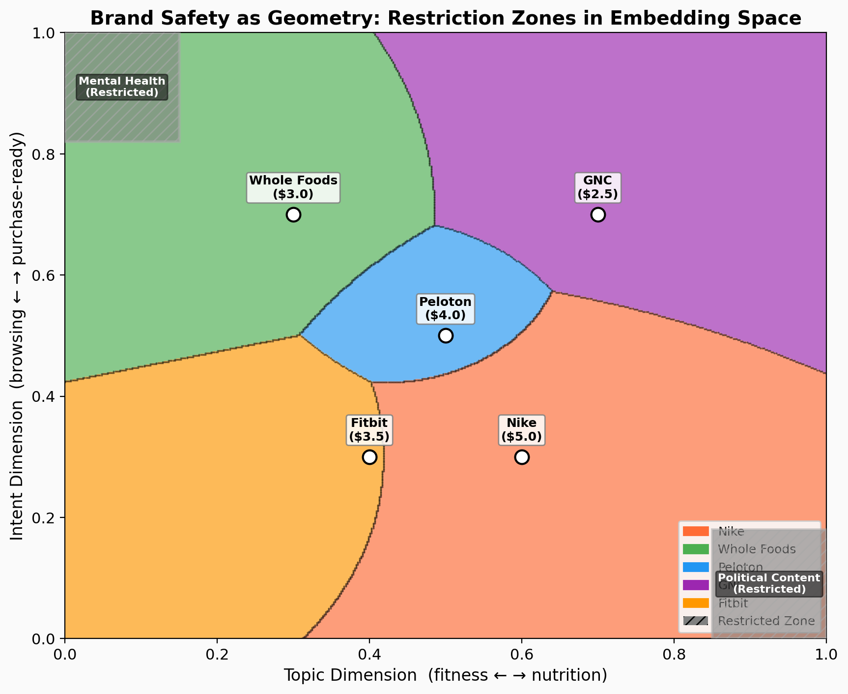
This catches semantically similar content regardless of wording. “Best ways to cope with depression” and “mental health crisis resources” land in the same part of the space, even though they share no keywords with a naive blocklist.
In the prototype, we have two default restriction zones: “Mental Health” and “Political Content,” rendered as gray hatched areas on the canvas. Each advertiser sees the fraction of impressions lost to restrictions, a direct measurement of the cost of brand safety.
Open Questions
The core interaction (hill-climbing through language, examples, and prices) scales to high dimensions because the advertiser never engages with dimensions directly. “Here are example queries, here’s what it costs, do I want to move closer or away?” works whether the space has 2 dimensions or 3,072.
The hard UX problems: how do you pick which suggestions to show when the neighborhood is 3,072-dimensional? And how do you generate examples that faithfully represent a high-dimensional region when two nearby-looking points on the 2D projection might be far apart in full space?
The auction mechanism works regardless of dimensionality. The question is building an interface that lets humans make good decisions in a space they can’t see. Try the interactive prototype and see for yourself.
Written with Claude Opus 4.6 via Claude Code. I directed the design; Claude built the prototype, generated diagrams, and drafted prose.
Part of the Vector Space series.